
The Two-Second Test: What Makes Packaging Stand Out?
What the Research Actually Shows About Packaging Psychology in a Crowded Category
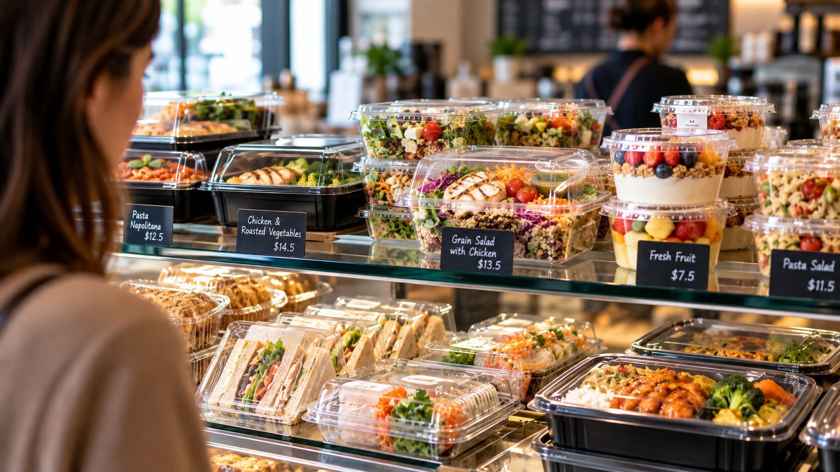
Stand at a bakery cabinet, a supermarket chiller, or a café counter lined with takeaway cups, and you’re watching a real-time psychology experiment. Every container is competing for the same few seconds of attention, and the research on how people actually make that call is more specific, and more useful, than most “make it pop” advice suggests.
Here’s what the studies actually say, and what it means for packaging in a visually saturated foodservice category.
The decision window is shorter than you think
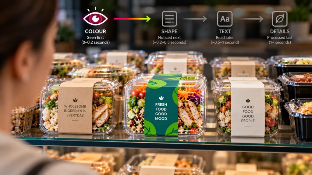
Shopper research consistently puts the decision moment at just a couple of seconds. Long enough to register colour and shape, not long enough to read copy. Shoppers spend an average of just two seconds deciding whether to pick up a product, meaning packaging has to grab attention, communicate key information, and prompt a purchase in that window. For a cabinet full of near-identical clamshells and cups, that two seconds is the entire pitch.
That’s not a minor design consideration; it’s the whole game. Most purchase decisions for packaged goods are made while people are actually shopping, not researched in advance, which means packaging often has to do the selling on its own.
Colour is processed before anything else on the container
Long before a customer reads a label or clocks a logo, they’ve registered colour. The brain processes colour tens of thousands of times faster than text, making it the first thing shoppers register when scanning a shelf, and research has linked colour strongly to brand recognition. Other research puts the influence even more starkly. Studies suggest the large majority of snap purchase judgements are driven by colour alone.
The practical implication: colour isn’t decoration on foodservice packaging; it’s the first (and sometimes only) signal a customer processes before deciding whether to look closer.
There’s a real tension between fitting in and standing out
This is where it gets interesting for anyone in a genuinely crowded category, and NZ and Australian foodservice, with its dense café and bakery scene, qualifies. Categories develop unwritten colour and shape conventions that customers use as shortcuts: green tends to signal health and natural, blue signals trust and cleanliness, red triggers urgency and appetite, and black signals premium. Brands have to choose whether to lean into those conventions for instant recognition, or break from them to stand out.
Marketing researchers who’ve studied this at scale, most notably the Ehrenberg-Bass Institute’s work on brand distinctiveness, describe the risk on the other side of that choice as a genuine competitive trap. When most competitors in a category start converging on the same look, packaging that plays it safe simply disappears into the shelf, regardless of how attractive it is in isolation. Standing out doesn’t mean abandoning category cues customers rely on to know what a product even is, it means owning a specific, consistent visual asset (a colour, a shape, a texture, a pattern) firmly enough that customers learn to spot it at a glance, rather than redesigning every season and starting the recognition process over.
Novelty grabs attention, but familiarity is what people actually like
This is the part most “stand out” advice misses, and it comes from a particularly relevant piece of research: a University of Melbourne and Lincoln University eye-tracking study that tested consumer response to novel versus familiar chocolate packaging. The study found that eye fixations on packaging don’t necessarily correlate with positive emotion. Familiar, commercially recognisable packaging produced a strong positive link between attention and liking, while novel concepts showed no such link.
In plain terms: an unfamiliar design might get looked at, but looking isn’t the same as liking. For everyday foodservice items – coffee cups, lunch boxes, bakery clamshells – customers are relying on subtle category cues (shape, lid style, material) to recognise a product type instantly. Break too many of those cues at once in pursuit of novelty, and you can win the glance and lose the warmth.
Sustainability cues have to be explicit, not assumed
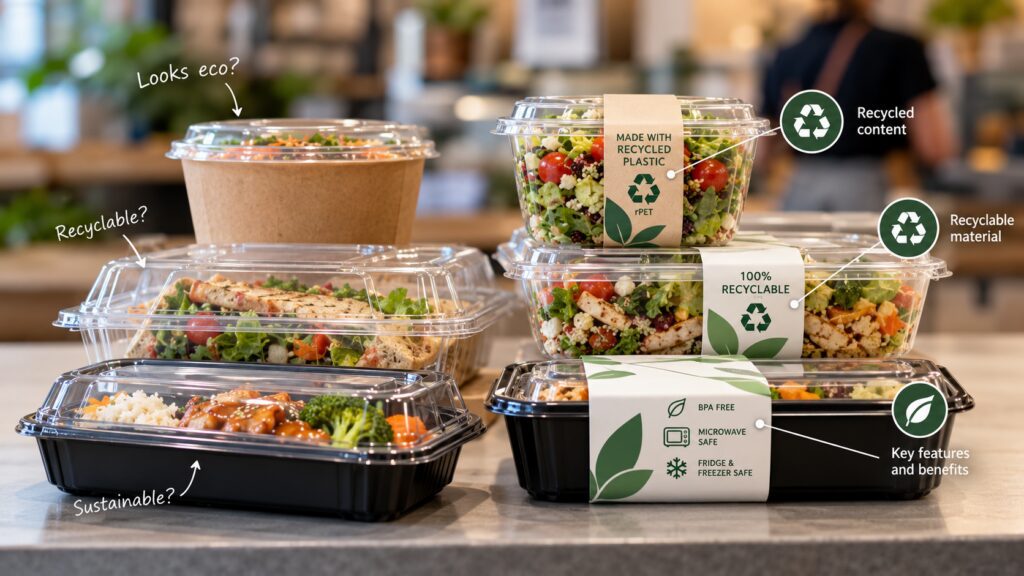
One more finding that matters directly for anyone using kraft, bagasse, or rPET as part of their story: customers largely can’t infer recyclability or sustainability credentials from appearance alone. Consumer education matters because shoppers can’t intuit recyclability from appearance, and clear on-pack cues (icons, recycled-content disclosures, and visibly recycled materials) are what actually guide behaviour and reinforce credibility.
A natural kraft-brown box reads as “eco” to a lot of shoppers regardless of what it’s actually made from, which cuts both ways. If your material story is genuinely part of the value proposition, it needs an explicit visual cue, not just an implied one.
What this means for a competitive counter or cabinet
Put together, the research points to a few concrete moves rather than vague “make it stand out” advice:
- Pick a colour and own it consistently across your range; rather than changing seasonally, recognition compounds over repeated sightings, and constant redesign resets that clock.
- Keep the category-recognisable shape cues intact; (lid type, general silhouette) even while changing colour or graphics, so novelty doesn’t tip into confusion.
- Don’t rely on material alone to communicate sustainability; pair it with a clear, simple visual cue if that’s part of what you want customers to take away.
- Test in situ, not in isolation; a design that looks sharp on a screen needs to be judged sitting next to the five other cabinets or counters it’s actually competing with.
The category is genuinely crowded, and that’s exactly why the small, well-evidenced choices (colour consistency, recognisable silhouette, honest material cues) tend to outperform a completely new look every season.
Thinking through how your packaging reads on a busy counter or cabinet? Get in touch with the Bonson NZ team – we can talk through format, colour, and material choices for your specific category.
